
Title VI analysis Agency
Compare service levels across minority and non-minority Census block groups using ACS data, with the four-fifths threshold convention from FTA Circular 4702.1B. Use it to identify equity concerns in an existing or proposed service before a board meeting, a hearing, or a Title VI program update.
What it is
Title VI of the Civil Rights Act of 1964 prohibits federally-funded programs — including most transit agencies — from discriminating on the basis of race, color, or national origin. For transit specifically, the Federal Transit Administration spells out what that means in FTA Circular 4702.1B ("Title VI Requirements and Guidelines for FTA Recipients"). Agencies receiving FTA funds owe FTA a Title VI program update every three years, plus an equity analysis any time they propose a major service change or fare change.
The hard part of doing a Title VI equity analysis is the data plumbing: aligning the GTFS feed with Census block groups, deciding which block groups count as "minority," computing service levels in each, and producing a table that supports the eventual finding. The GTFS·X Title VI panel does that plumbing on a feed you already have open, so you can ask "does this service look equitable?" while you're still designing it — not the night before the public hearing.
The regulatory context, briefly
Two terms from the FTA circular are worth getting right before reading any tool output:
- Disparate impact (DI). A facially neutral policy that disproportionately affects a protected group (here: minority populations). The DI threshold in transit practice is the four-fifths rule: if minority-area service is less than 80% of non-minority-area service (a ratio < 0.80), the change is presumptively disparate and the agency must either modify it or show a substantial legitimate justification with no less-discriminatory alternative.
- Disproportionate burden (DB). The analogous concept for low-income populations, which Title VI itself doesn't cover but FTA reviews under Executive Order 12898 on environmental justice. Each agency adopts its own DB threshold in its Title VI program; the four-fifths convention is common but not mandated.
The GTFS·X Title VI tool focuses on the DI side — race and ethnicity from ACS table B03002 — and reports an equity ratio that you compare against the agency's adopted threshold (typically 0.80). For DB analysis on low-income population, run the equivalent comparison using the demographic data from the Coverage tool with low-income variables; that analysis isn't automated in the Title VI panel today.
What the tool computes
Inputs:
- Stops from the open feed. Each stop is buffered by either 0.25 miles (general) or 0.5 miles (high-frequency, defined as peak-hour headway ≤ 15 minutes) — see "Methodology and limits" below for why.
- Trips from
stop_times.txt. The tool counts unique trips serving each stop on the dominant service day. That's the service intensity each block group "sees." Trips per hour at each stop also drive the buffer-tier classification above. - ACS 2022 5-year data: B03002 (Hispanic or Latino origin by race) for the racial composition of each block group, B01003 for total population.
The computation:
- For each block group in the service area, compute minority share = (total population − non-Hispanic white population) / total population.
- Compute the regional minority share across all block groups in the service area (population-weighted average). Block groups with a minority share at or above the regional average are classified minority; the rest are non-minority.
- For each block group, compute service exposure as the sum of (daily trips at stop × overlap fraction) over every stop within a half-mile.
- Aggregate population and service exposure separately for the minority and non-minority groups, then divide each group's service exposure by its population to get a service-per-capita figure.
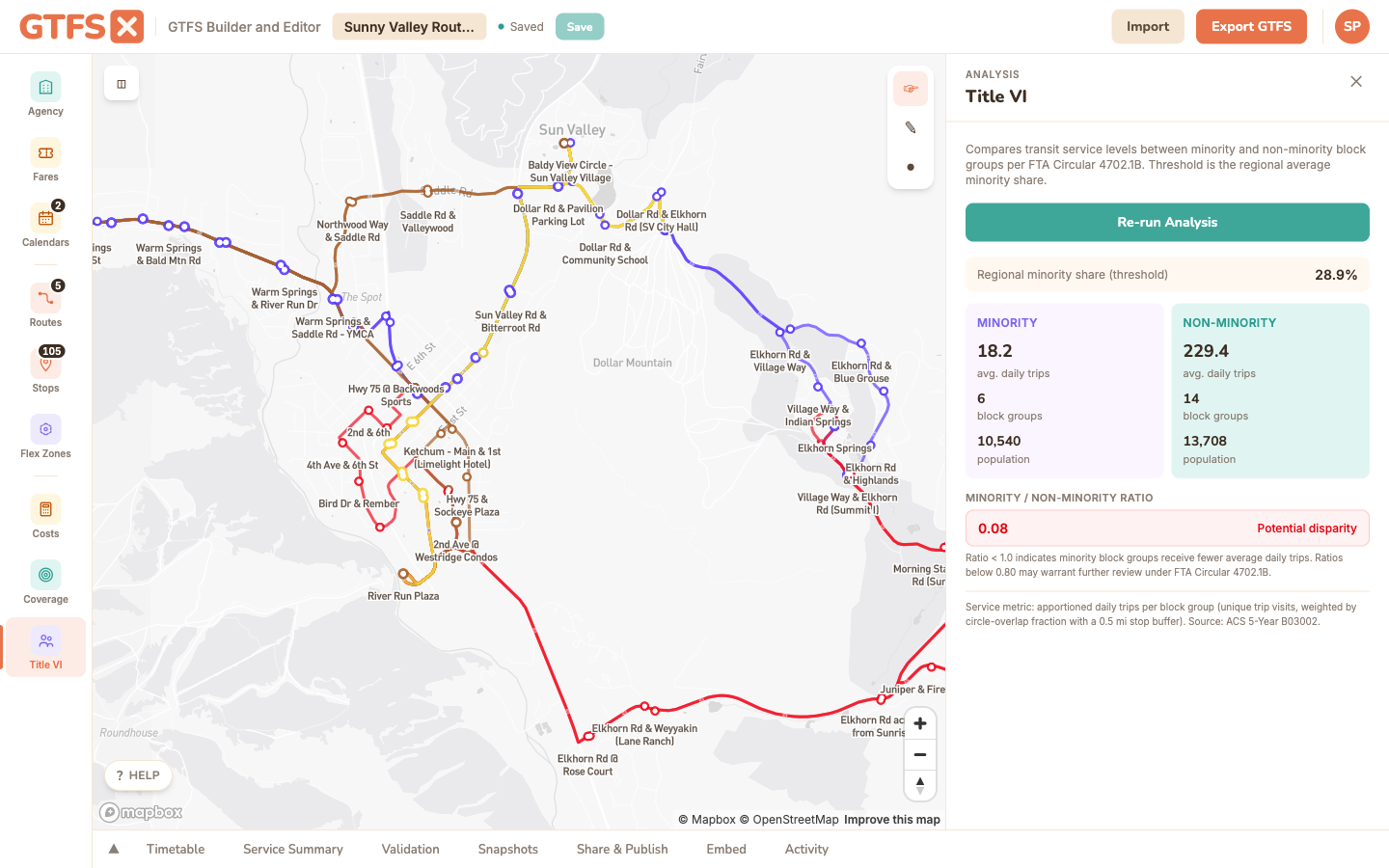
- The reported equity ratio is minority service-per-capita ÷ non-minority service-per-capita. A ratio of 1.0 means the two groups receive equal service intensity; below 0.80 crosses the four-fifths threshold; above 1.0 means the minority population is served more intensively than the non-minority population.
The panel surfaces the equity ratio with a color band: green at or above 1.0, amber from 0.80 to 1.0 (worth a closer look), red below 0.80 (presumptively disparate under the four-fifths rule). The block-group-level numbers are exposed in the underlying data so you can dig in or export them.
How to use it
- Open the feed in the editor and click Title VI in the left sidebar (it sits below Coverage). The panel opens on the right.
- Click Run Title VI Analysis. The tool fetches the relevant Census block groups, computes the comparison, and renders the result. First run for a given region takes a few seconds; subsequent runs are cached locally.
- Read the two cards at the top: Minority and Non-Minority. Each shows the population served, the block group count, and the average daily trips per capita.
- Check the equity ratio band. If it's red or amber, look at the block-group breakdown to see which areas are pulling the average down — often a single corridor.
Reading the output
The Title VI panel is descriptive, not prescriptive. A green ratio doesn't certify your feed as compliant, and a red ratio doesn't doom a service change — it tells you where the conversation needs to go.
- Green (≥ 1.0). Minority block groups receive at least the same trips-per-capita as non-minority block groups. Good baseline. Document it.
- Amber (0.80 – 1.0). Below parity but above the four-fifths floor. Many agencies sit here on existing networks; the discussion is whether a proposed change widens or narrows the gap.
- Red (< 0.80). Presumptive disparate impact under the four-fifths convention. The agency needs either a less-discriminatory alternative or a documented substantial legitimate justification before adopting the change.
For a change analysis (the most common Title VI use), run the tool on the current feed, then on the proposed feed, and compare the two ratios. The change itself is what FTA cares about — not the absolute level.
What the tool isn't
Methodology and limits
- Two-tier stop buffer. Each stop draws its service area at one of two distances: 0.25 mile (the conventional walking-distance threshold for local bus service) for general stops, or 0.5 mile (the threshold often applied to rail and BRT) for high-frequency stops. The high-frequency tier is triggered when the stop's peak-hour headway is 15 minutes or less, computed as the single hour-of-day with the most trips serving that stop. This matches the local practice that "frequent service draws riders from farther" while keeping the bulk of the network on the tighter 0.25-mile buffer.
- Circle-circle apportionment. Block groups are modeled as discs (half-mile radius centered on the tract centroid) rather than their actual polygon geometry. This is a deliberate approximation — block-group boundaries are jagged and the analytic precision rarely matters at the scale of the four-fifths comparison — but it does mean a sparse rural block group with one stop on its edge will be over-counted relative to its true shape. If your service area is small or unusually shaped, run the numbers through a polygon-aware tool (Remix, ArcGIS) to confirm.
- Trip count, not headway-weighted in the comparison itself. The buffer choice uses headway, but the per-block-group service metric is still the raw daily trip count apportioned through the buffer. A 15-minute corridor with 60 daily trips contributes 60 trips to its block groups; a 60-trip commuter expressway contributes the same. For agencies that weight trips by frequency or span in their program documentation, recompute with that adjustment.
- One race / ethnicity table. The analysis uses ACS B03002 (Hispanic origin by race) and reports a single minority/non-minority split. It doesn't compute breakdowns by individual racial group, by primary language, or by limited-English-proficiency status. Those analyses still need to happen — they just don't happen in this panel.
- ACS vintage. Currently using the 2022 5-year ACS. If your agency's adopted methodology requires a different vintage, the tool's output won't be directly comparable — note the vintage in any document that cites the result.
References
- FTA — Title VI requirements for FTA recipients (entry point for Circular 4702.1B and supporting guidance).
- FTA Circular 4702.1B (PDF) — the actual circular.
- US Census ACS — source of the demographic data used by the tool.
See also
- Demographic coverage — the same Census plumbing used for total population, households, and jobs served.
- Rider propensity — demographic-driven heatmap for proactive service planning.
- Service summary — trip-count and revenue-hour figures often quoted alongside Title VI results.