
Rider propensity Free
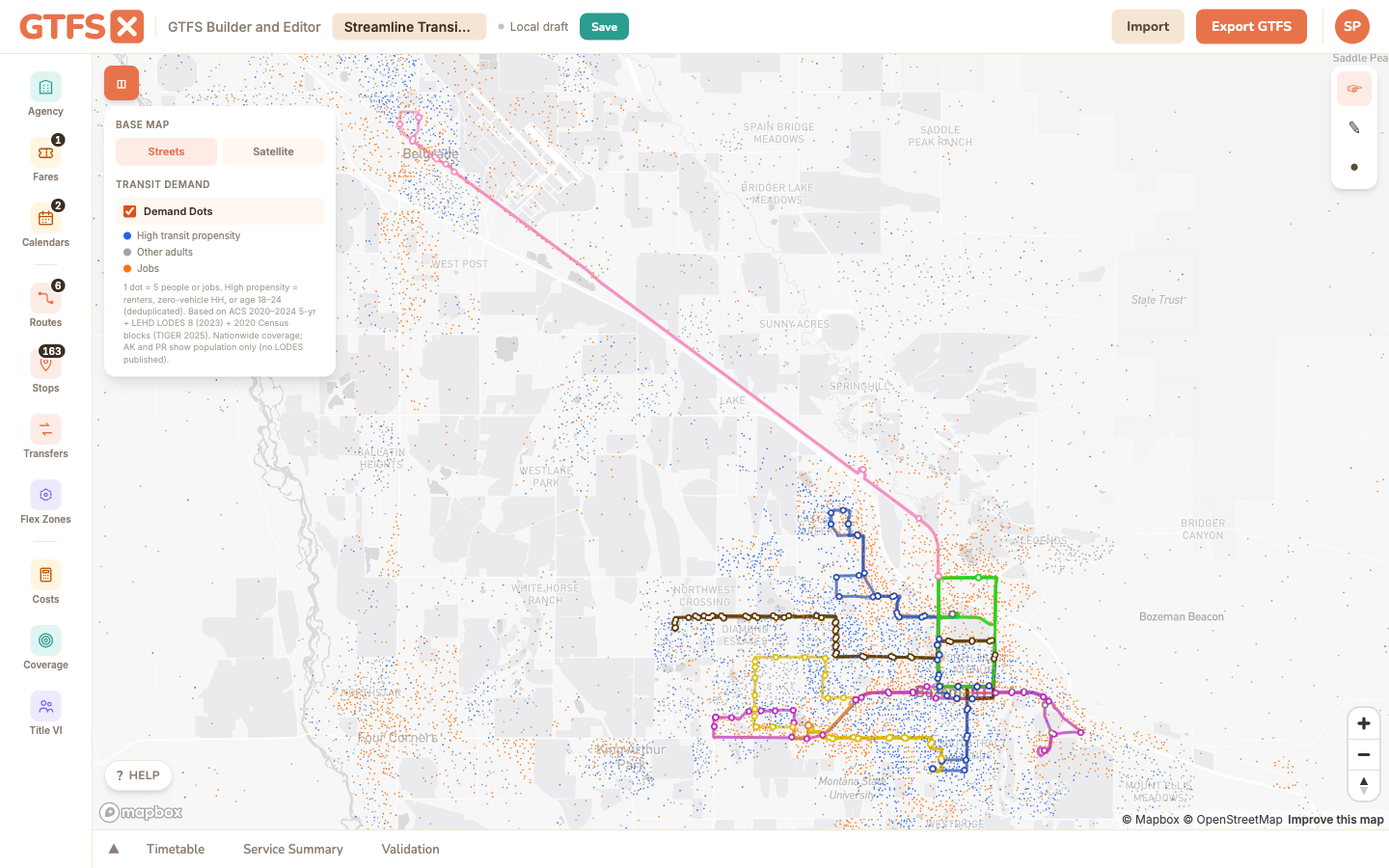
A nationwide Demand Dots map layer that surfaces likely transit demand — population most likely to ride and the jobs they could be commuting to — as dots rendered directly on the basemap. Use it to spot under-served demand pockets when sketching a new route or sizing a flex zone.
Where to find it
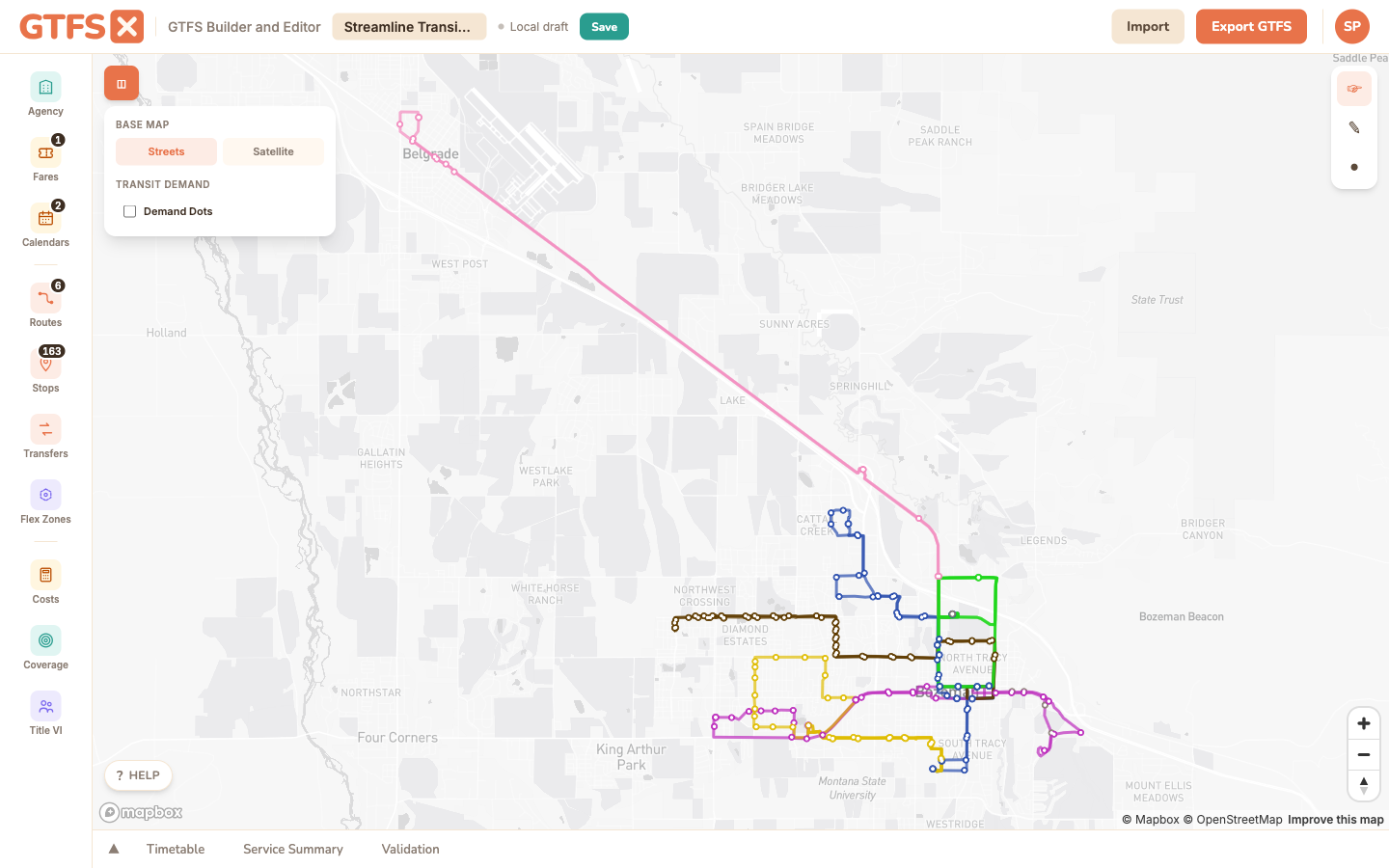
Demand Dots is a basemap layer toggle, not a sidebar panel. Open the basemap control on the top-right of the map (the small square icon below the zoom controls) and check the Demand Dots box. The dots appear at every zoom level; they're most legible from neighborhood-scale (zoom ~12) to corridor-scale (zoom ~15).
What the dots show
The layer renders three categories of dots, each at a one-dot-equals-five-units density:
- Blue — high-propensity adults. Population estimated to be more likely to ride transit than the general population: renters, members of zero-vehicle households, and adults 18–24. The three groups overlap, so a 0.6 deduplication factor is applied. Distributed within each Census block according to land area.
- Gray — other adults. The rest of the adult population, by the same block-level distribution. The contrast between blue and gray is the part that matters; areas where blue dots dominate are higher-propensity neighborhoods.
- Orange — jobs. Workplace locations from LEHD LODES workplace-area characteristics, distributed within each block. A dense cluster of orange dots is the demand side a commute route is feeding.
The layer is nationwide: every state, plus DC. Alaska and Puerto Rico render the population layers (blue and gray) but not jobs, because LODES isn't published for those jurisdictions.
How to use it
- Sizing a new route. Zoom to the corridor you're considering, toggle Demand Dots on, and look at how the proposed alignment intersects the dot density. A route that runs through blue-and-orange together is going to perform better than the same mileage of road through neither.
- Locating a flex zone. Demand Dots is particularly useful for non-fixed-route service. A flex zone polygon drawn around a high blue-dot density gives you a defensible service area; the same polygon drawn around mostly empty space tells you the demographics don't support the service even before you crunch a single ridership number.
- Comparing scenarios. Toggle the layer with your existing network visible, then with a proposed change visible. Where do the dots that were covered stop being covered? Where do new dots come into reach?
- Telling the story. A map screenshot with Demand Dots overlaid often communicates "this is who we'd be serving" more directly to a board than the equivalent table of demographic figures.
What it isn't
Methodology
- Population. ACS 2020–2024 5-year estimates at the Census block group level, allocated to 2020 Census blocks by land area. High-propensity population is the union of three indicators — renter households (B25003), zero-vehicle households (B25044), and adults 18–24 (B01001 age-by-sex) — with a 0.6 deduplication factor to correct for the overlap between the three groups. Total adult population is treated as 78% of total population (standard ACS-derived figure); other adults = total adults − high-propensity adults.
- Jobs. LEHD LODES 8 (2023) workplace-area characteristics, block-level. Reports total jobs per block; not split by sector or wage tier in this layer.
- Rendering. Vector tiles served from the GTFS·X tile origin. Each dot represents five people or five jobs, randomly placed within the block (consistent across zoom levels). At low zooms the layer downsamples to keep render time reasonable.
- Vintages. ACS 2020–2024 5-year, LODES 2023, TIGER 2025 block boundaries. Re-rendered when the underlying vintages refresh — annually for ACS, on LODES release cadence for jobs.
Limits
- The high-propensity indicators are national-average proxies. Calibrating them to a specific region (different car-ownership patterns, age structure, transit culture) isn't yet supported.
- Jobs are by workplace, not by commute mode. A dense orange cluster could be a hospital where most employees drive; the layer can't distinguish.
- The dots are a visual representation — not a hover-tooltip lookup. For exact population counts inside a buffer, use the Coverage panel; for an equity-style comparison, use the Title VI analysis panel.
- Alaska and Puerto Rico are population-only; LODES does not publish for those jurisdictions.
See also
- Demographic coverage — exact population and job counts within a stop buffer.
- Title VI analysis — equity comparison using the same Census plumbing.
- Routes & shapes — drawing alignments over the dots.
- Flex zones — common pairing for sizing demand-responsive service areas.