
Stop analysis Planner
Four stop-level diagnostics computed straight from the feed: how far apart your stops sit, which neighbouring pairs are candidates for consolidation, how much service each stop actually gets, and whether your board points carry wheelchair-accessibility data. Every table exports to CSV, and the findings highlight on the map as you read them.
What it is
Stop placement is one of the highest-leverage, least-examined decisions an agency makes. Stops that are too close together slow every trip and inflate operating cost; stops that are too far apart strand riders. Most agencies never look at the distribution because pulling it out of a GTFS feed by hand is tedious. Stop Analysis does it in one panel — open it on any feed and read four diagnostics computed client-side from the schedule, with no setup and nothing uploaded anywhere.
It is a planning aid, not a mandate: the thresholds are defaults you can change, and the consolidation candidates are suggestions to review on the map, not stops to delete blindly.
The four diagnostics
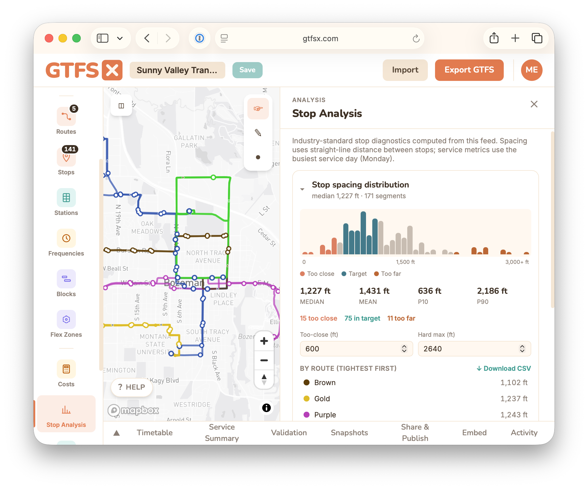
Stop-spacing distribution
A histogram of the distance between consecutive stops across the system, with the median, mean, and the 10th / 90th percentiles called out. Segments are colour-coded against APTA / TransitWiki benchmarks — too close (under ~600 ft), in target (~750–1,320 ft), and too far (over ~2,640 ft) — and the panel tallies how many fall in each band. Below the histogram, a per-route table sorts routes tightest-median-first so you can see which lines drive the pattern. Spacing is measured along each route's dominant trip pattern (the longest trip per direction).
Stop-balancing candidates
Consecutive same-route stop pairs closer than your too-close threshold (600 ft by default), flagged for possible consolidation. Each candidate shows an order-of-magnitude daily time saving (dwell seconds × trips per day) so you can prioritize. Terminals and stations are excluded, and the lower-service stop of the pair is offered as the removal candidate.
Service intensity per stop
For each stop: trips per day, span of service, and the peak vs. off-peak median headway on the busiest weekday (or a service day you pick). It answers "how much service does this stop actually see?" — useful for spotting over- and under-served stops, and it's also surfaced on the per-stop Trips tab in the editor.
Accessibility completeness
The share of board points that have wheelchair_boarding populated, plus a per-route breakdown of the gaps. This is the detailed view behind the single accessibility warning in the validator — clear the gaps here and the warning clears too.
How to use it in GTFS·X
- Open the feed and click Stop Analysis under Analysis in the left rail. The panel opens on the right and the map switches to the analysis overlay.
- Adjust the Too-close and Hard max thresholds (defaults 600 ft and 2,640 ft) if your context differs — coverage-oriented rural service and dense urban grids have different targets.
- Expand each diagnostic. Hover or click a flagged candidate to highlight it on the map: removal candidates render amber, a trips-per-day colour ramp shades stops by service intensity, and accessibility gaps drop pins.
- Use Download CSV on any section to pull the figures into a spreadsheet for a memo or a stop-rationalization workshop.
Methodology & limits
- Distances are great-circle (Haversine), in feet.
shape_dist_traveledis deliberately not used — GTFS leaves its unit undefined, so it can't be trusted across arbitrary feeds. - Spacing uses the dominant pattern. The longest trip per direction stands in for the route, so a rare short-turn variant doesn't skew the histogram.
- Thresholds are conventions, not rules. The 600 / 750–1,320 / 2,640 ft bands come from widely-cited stop-spacing guidance; tune them to your service type.
- No ridership is synthesised. Service intensity counts trips, not boardings — an honest stop-level ridership estimate needs APC data the feed doesn't contain.
See also
- Service summary — system-level revenue hours, trip counts, and peak vehicles.
- Demographic coverage — who lives within walking distance of these stops.
- Validation — where the accessibility-completeness warning surfaces.
- Stops — placing and editing the stops this panel analyses.